I am currently in the process of re-evaluating my PowerPoint slide designs and templates that I use for my lectures. As a rough estimate, I have somewhere between 2,000 and 3,000 slides spread over many files. Over the last ten years, I have used the same template for all of them, with minor modifications. In the next few months, I plan to give them an overhaul – update the designs and screenshots (there are still some Windows XP slides lurking in some of my files, which really stick out now, and not in a good way), experiment with new layouts, graphics, and content. I have just bought some books that I’m sure will be very helpful in this process, including Slide:ology by Nancy Duarte, Presentation Zen and Presentation Zen Design by Garr Reynolds, and the Non-Designer’s Presentation Book by Robin Williams. I like to think I’m fairly good at slide design and presentation, but I also know there is much more I can learn. Some of what they recommend is old hat to me (e.g., less text, more graphics) or cliché (the expression “death by PowerPoint” is so overused but, sadly, still often needed) but I am voraciously reading all of these books to broaden my thinking for presentation design and execution.
So, on the topic of slide design, I thought I would share a couple of tips that might be helpful when using ArcGIS maps in PowerPoint. First, I design maps specifically for use as slides whenever possible. If you have the time, your audience will notice the difference (the small fonts and pastel shades often used for print maps just don’t translate well when projected for any kind of larger audience). In ArcMap, create a custom page size that matches the dimensions you want to use, such as 7.5 x 10 inches for a map that will fill a traditional slide (sometimes I make them 6×10 inches to leave room at the top for a title). Then set the data frame size to be the same as the page, with no offset or margin.
Create your map, keeping in mind that the colour schemes, line weights, and symbol sizes should be slightly exaggerated. I tend to use somewhat brighter, more vibrant colours for PowerPoint than I would for a print map, especially if the room I will present in won’t be that dark. You also want the message you are communicating with your map to be easily grasped in a few seconds (this may also be true for print, but I think more so for presentation). I then export the map from ArcMap as a 200 dpi jpeg file. If 200 dpi seems like overkill, it often is, but it gives me more flexibility if I later want to enlarge and crop the map. The trade-off in file size is worth it for me, but you may want to go with a smaller image resolution. I then add the map into PowerPoint. I usually cut and paste the legend from ArcMap directly into PowerPoint so I have the option of moving it later if I want to add a label or other text to the map.
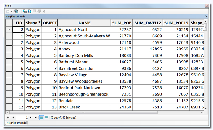
When adding attribute tables to PowerPoint, follow the same guidelines for text size you would use for any other slide text. In other words, the attribute table text should be BIG. I often see presentations where people fail to do this and I always think “Why show an attribute table if we can’t see the contents?”
When bringing in screenshots of attribute tables or any dialog box into PowerPoint, I first set the size of the window so that I have a predictable, consistent size for every one. There is an incredibly useful, free utility for Windows called Sizer (http://www.brianapps.net/sizer/), that allows you to set custom window sizes (it does not officially support 64-bit Windows 7, but I have not had any issues). Since I show a lot of tables and dialog boxes in my lectures, I find it helpful to maintain consistent sizes throughout.
As time-consuming as slide design can be, I really enjoy the process, as I’m always trying to find a simpler, more effective way to tell a story. I hope the above tips will help streamline your workflow and help you do the same.


Leave a Reply